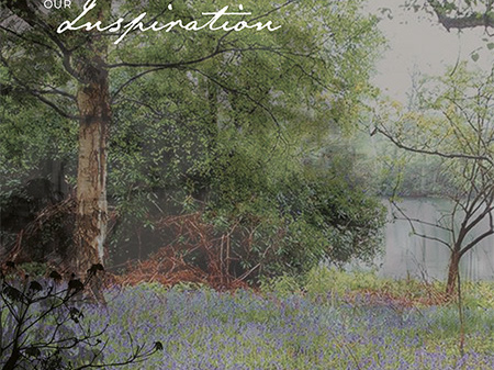
Refresh of existing brand to bring it up-to-date for retail. The brief was to retain the key concept of English heritage and countryside, which I did whilst incorporating more elegance and consitency.

OLD LOGO
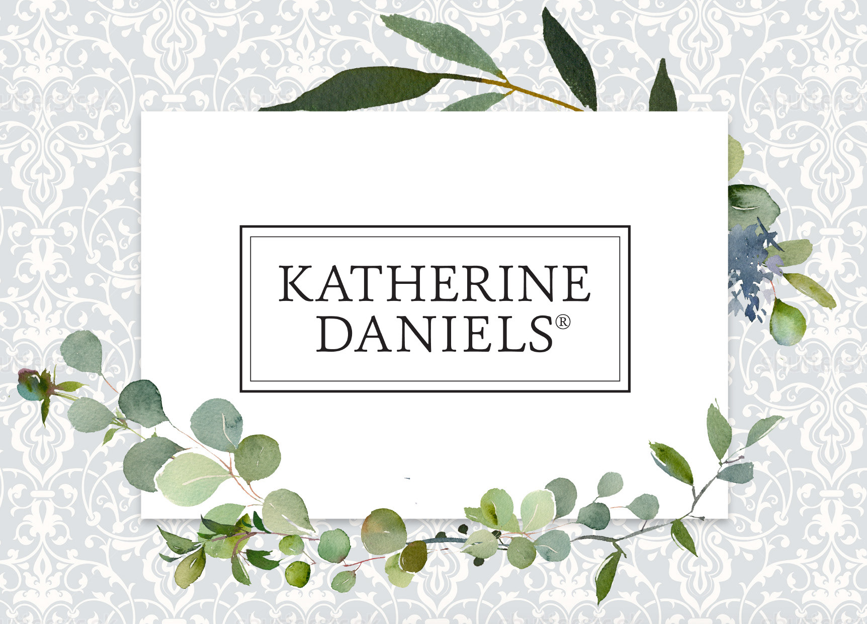
NEW LOGO
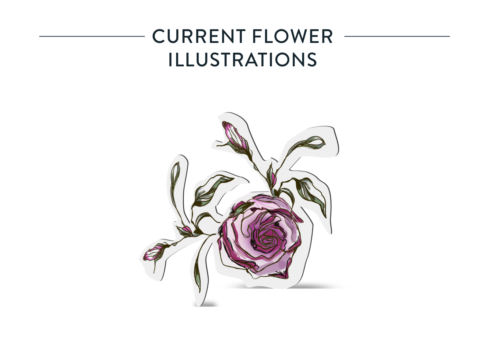
Flower illustrations that were used previously
were quite harsh and almost gothic. I felt that
I could retain the idea of flower illustrations but
more subtle and elegent.


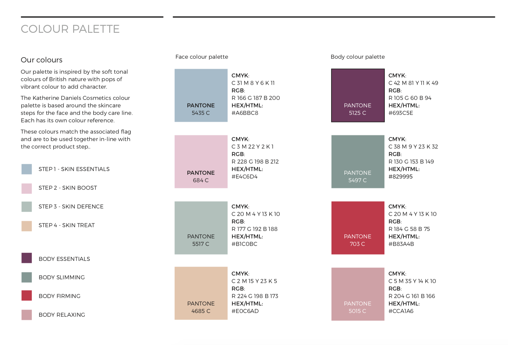
PREVIOUS COLOUR PALETTE
The previous brand colour palette was a little 'primary' and didn't quite work individually. We felt that a more 'Farrow & Ball' feel.